Design Systems — 2024 / Supplyframe
Fragments
Building a Design System That Ships
◆ The Core Problem
Components existed. A system didn't.
Supplyframe had components scattered across the organization, but their implementation was inconsistent. Buttons appeared in three different styles depending on the team.
Spacing, typography, and component behavior varied widely because no shared specifications existed for states, breakpoints, or edge cases. There was a component library, but not an applied design system.


The same action buttons before and after Fragments — inconsistent styles and states resolved into one system. Toggle to compare.
◆ Research
Three parallel tracks
01
Implementation audit
Cataloged actual component usage across the product to identify drift in form inputs, typography scales, and state behaviors.
02
Team conversations
Interviewed designers and developers about pain points and the workarounds they'd built when documentation was absent.
03
External benchmarking
Studied Material, Carbon, and Polaris to understand what documentation structure encourages adoption over asking a colleague.
◆ The Solution
Four documentation layers, every component
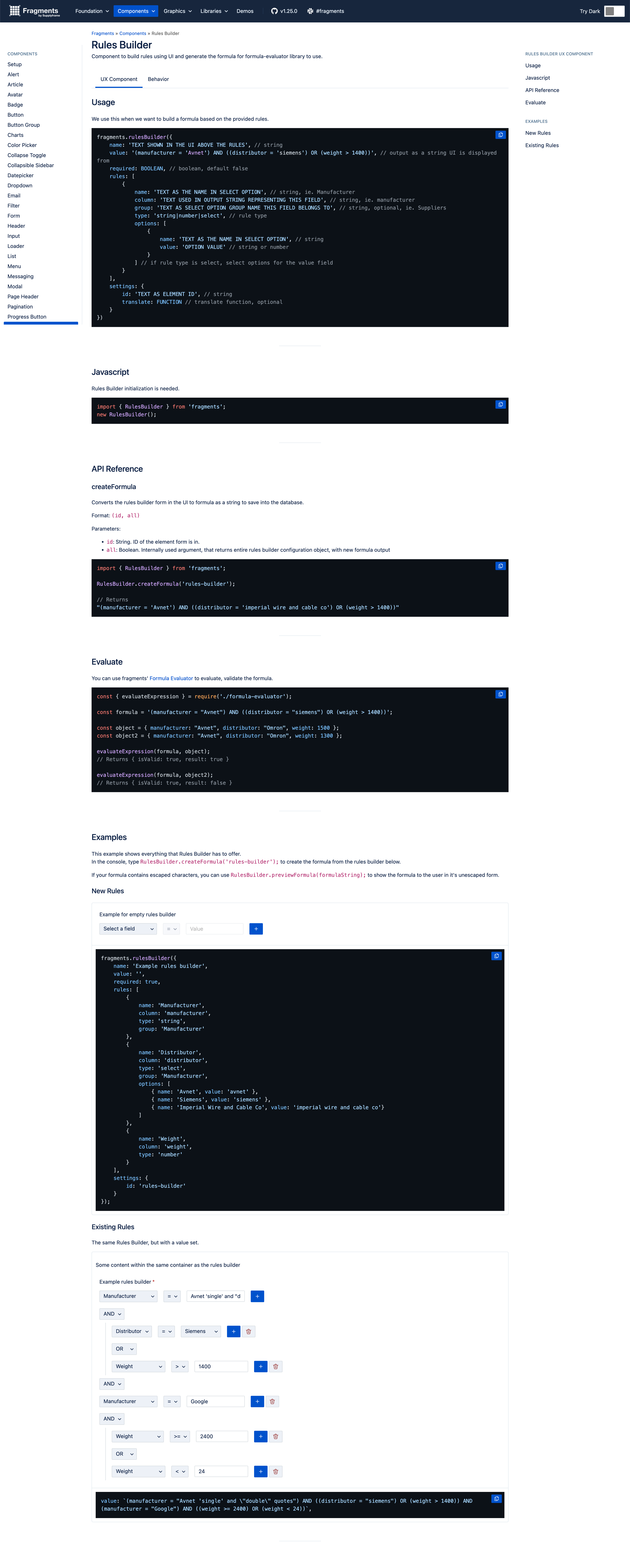
A component isn't documented when you can see it — it's documented when a developer knows how it behaves in every state, at every breakpoint, against every edge case. Each of the 37 components got all four:
Interaction specs
All possible states — hover, focus, active, disabled, error, loading — and exactly what triggers each.
Usage guidelines
When to reach for this component versus an alternative, so teams choose consistently.
Responsive behavior
How the component adapts across breakpoints and interaction modes.
Edge cases
Long text, empty data, and error combinations — the conditions that quietly break undocumented components.
◆ Implementation
Two formats, one source of truth
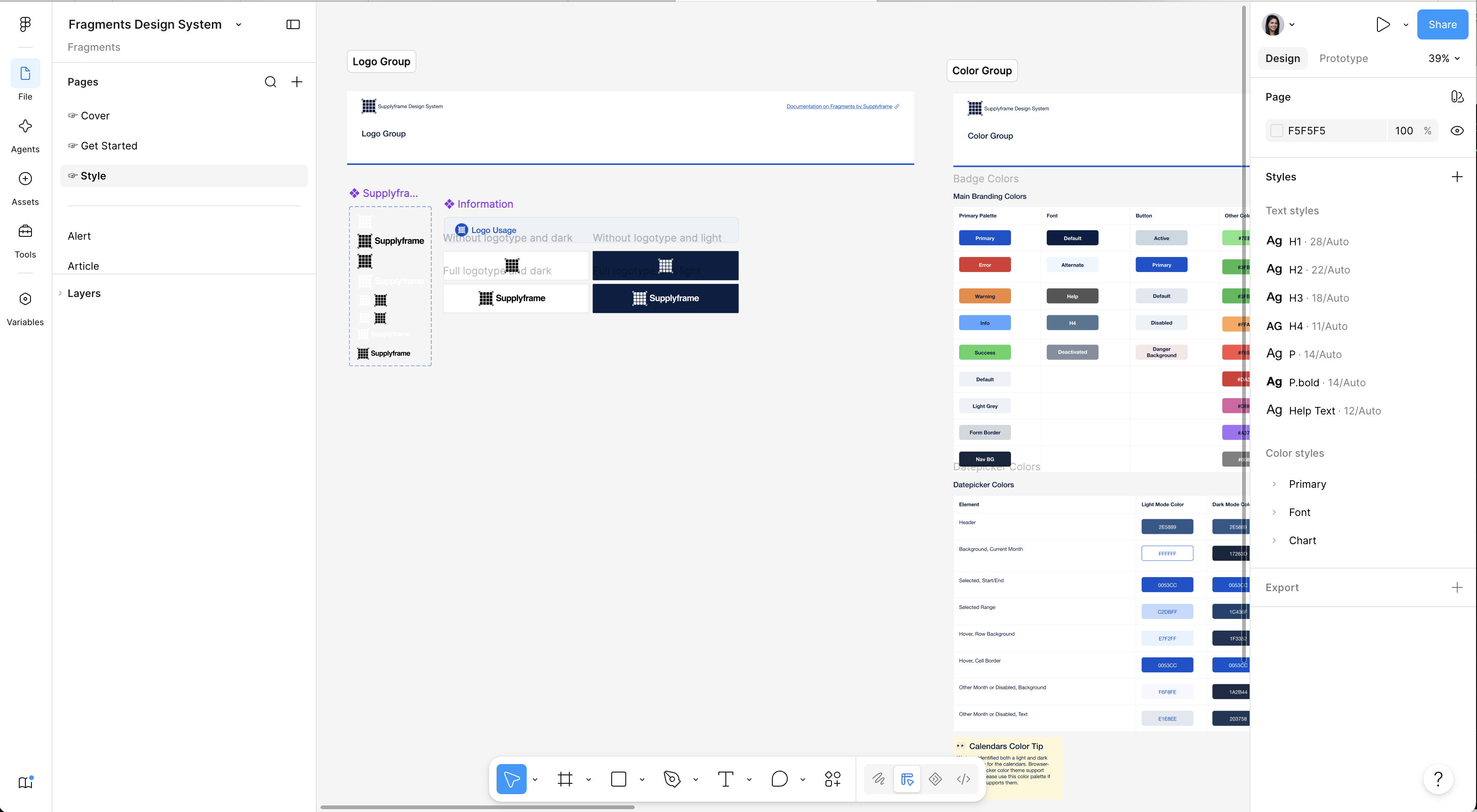
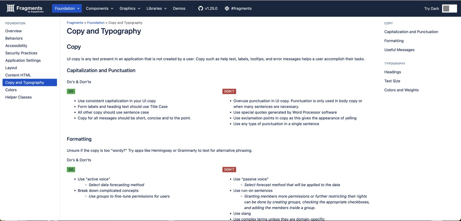
Documentation lived in two places so it met people where they worked: Figma annotations for designers in their daily flow, and an internal documentation site serving as the single source of truth for every team.
The site is where the system stopped being a designer's artifact and became company infrastructure.
◆ Results
From sprawl to shared infrastructure
37
components documented and adopted company-wide
4
documentation layers per component
SDR
non-design teams building professional internal sites with Fragments
Clear specifications meant faster feature delivery and a consistent UI across the product. When a sales team can build a professional internal site without a designer, the system has done its job.
◆ Key Learning
Sometimes well-documented components reveal that a better solution exists.
The most valuable insight came from documenting a complex rule-builder form. Laying out its full behavior made its complexity impossible to ignore — and made the case that users would be better served by an AI chat interface instead. That realization became the seed of the next project.